CSS rules implied when working with percentage (%) unit
Senior Frontend Dev. Mostly Angular and Svelte. I will be sharing my day-to-day learning experiences here with the community.
Recently I was working on an assignment where-in I was positioning element w.r.t. parent element and setting height of 100%. I expected that, the child container will take up all the available parent height but that was not the case. On digging-down further, I understood few of basic CSS principles which I can summarize in two sections:
- Using percentage unit on an element with
positionproperty set. - Fixing height set to 100% on an element with
positionproperty set.
Using percentage unit on an element with position property set
Using percentage unit on an element with position set to fixed
When we set position
fixedon an element, it gets detached from the regular document flow. So the parent of such element is not the nearest div but the viewport!
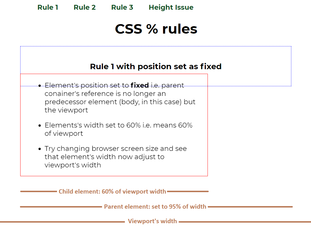
- here child element (with red border) has position set to
fixed. - if we use percentage here, e.g.
width: 60%then it will be 60% of the viewport's width and NOT that of parent (with blue border) width - reason is, when we used
fixedproperty, the element gets detached from regular DOM flow & now the reference parent element will be viewport
Using percentage unit on an element with position set to absolute
When we set position
absoluteon an element, the parent of such element is the nearest element with position set to either ofrelative,absolute,fixedorsticky. In other words parent element will be the element with position property other thanstatic(browser default). The dimension includes length of content + padding.
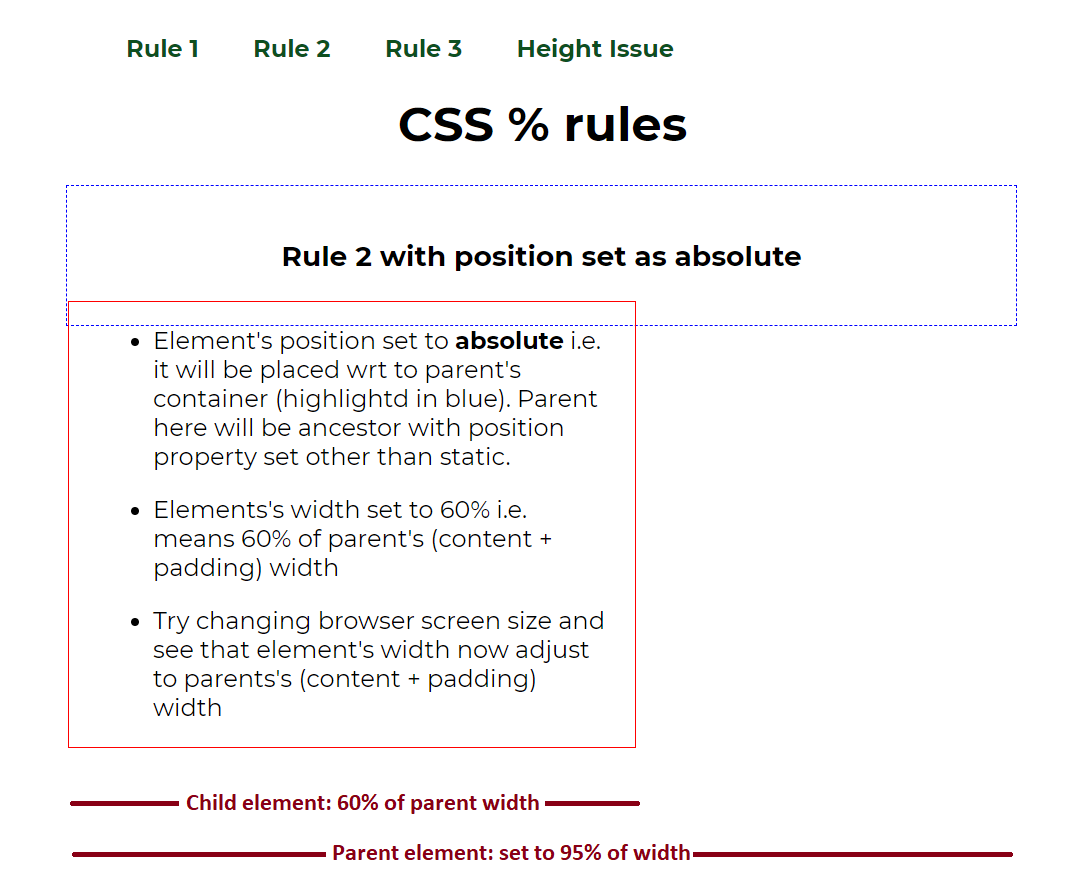
- here child element (with red border) has position set to
absolute. - if we use percentage here, e.g.
width: 60%then it will be 60% of the parent element's width. - here
width = content width of parent + padding. Example, If parent element has 16px of padding set, 1px of border and 16px of margin and the content takes dimension of (900 x 400). With these figures, the parent element's will be calculated as 900 + 16 + 16 = 932px i.e. width of content plus padding. So the child's width will be 60% of 932px.
Using percentage unit on an element with position set to relative or static
When we set position
relativeorstaticon an element, the parent of such element is the nearest block level element. The dimension includes length of content only.
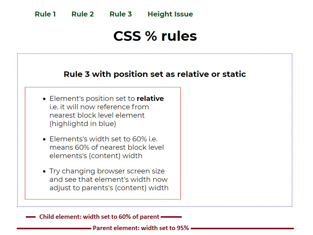
- here child element (with red border) has position set to
relative. - if we use percentage here, e.g.
width: 60%then it will be 60% of the parent element's width. - here
width = content width of parent. Example, If parent element has 16px of padding set, 1px of border and 16px of margin and the content takes dimension of (900 x 400). With these figures, the parent element's will be calculated as 900px i.e. width of content. So the child's width will be 60% of 900px
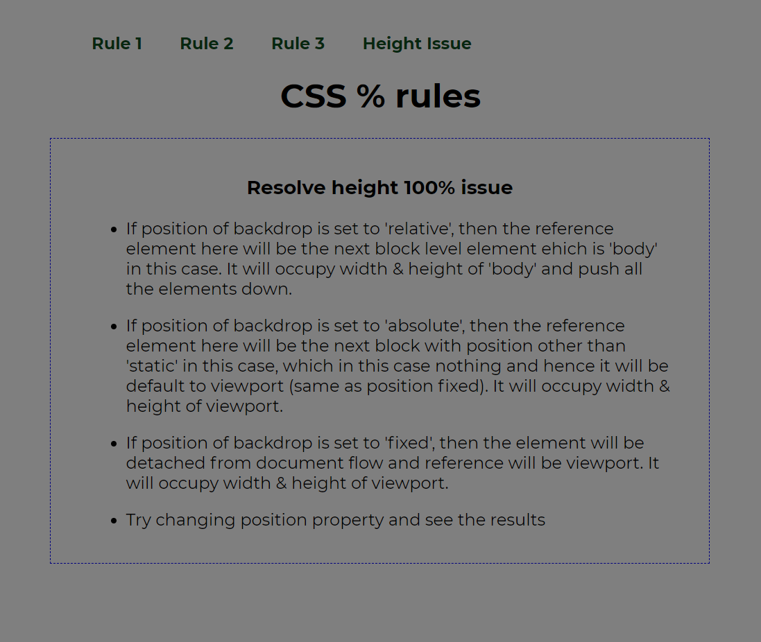
Fixing height set to 100% on an element with position property set
Using percentage unit on an element with position set to relative or static
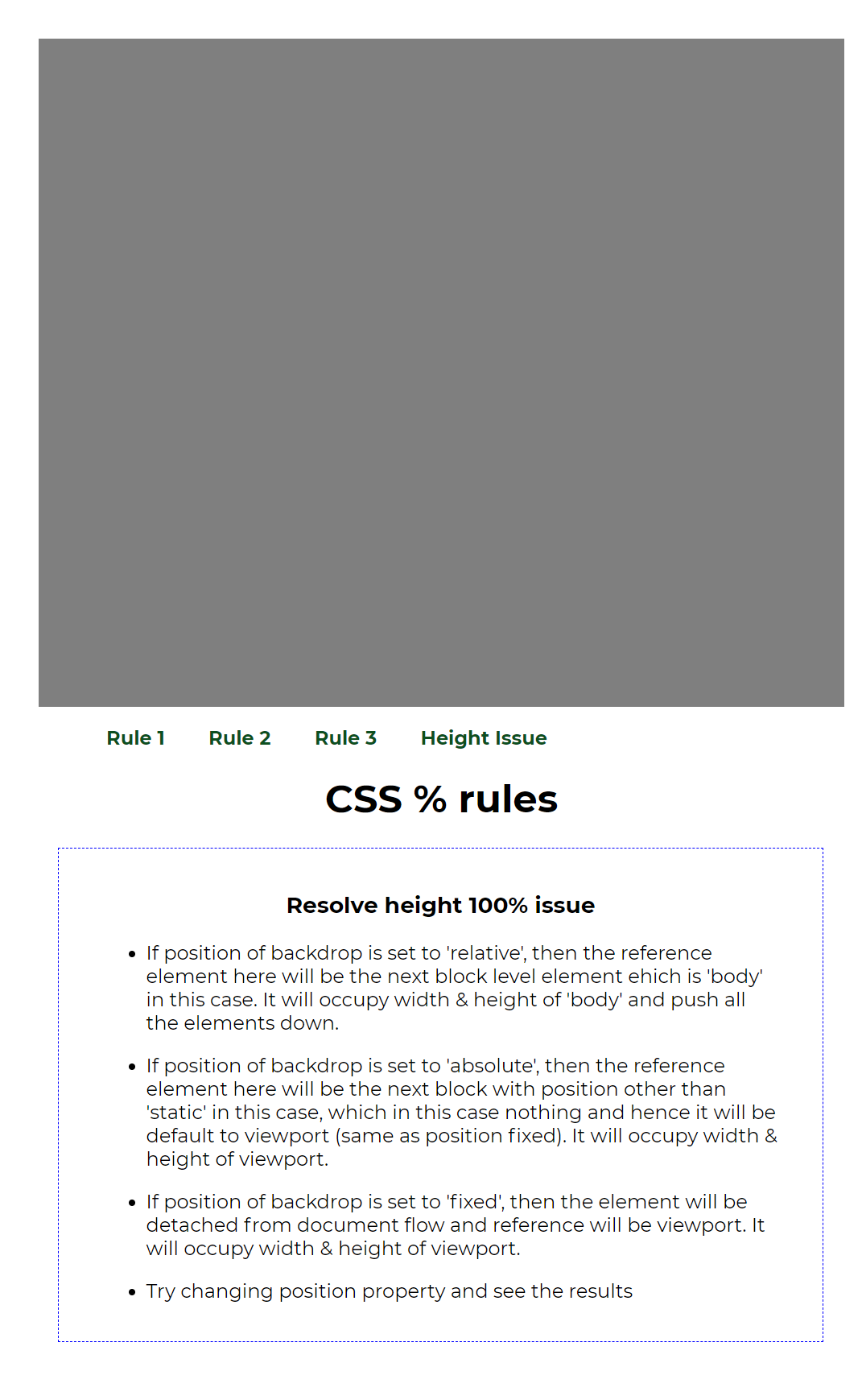
As discussed above, setting position to relative makes the parent reference element to the nearest block level element. So the height will be inherited from the nearest parent (body, in this case). It will push the entire content after the backdrop, refer the screenshot below:
Using percentage unit on an element with position set to absolute & fixed
When using absolute position, the parent reference element to the nearest element with position property other than static. In our example (refer stackbliz) it will be viewport, which will be the same for fixed as well. So the height will be inherited from the viewport and it will overlap all the body elements, refer the screenshot below: